What do really bad sequences of stock returns actually look like?
Posted on February 23, 2018

When were retired we’re in the Spend and Invest phase. We’re withdrawing from our portfolio each year for our spending. We’re stressing its health each year. Most times it remains healthy or even grows to be super-healthy over our retirement. We Nest Eggers are most concerned about HORRIBLE sequences of return that can deliver a blow so harmful that we can’t keep our portfolio healthy. It ultimately can deplete. The purpose of this post is to numerically understand the sequences of return that could deplete our portfolio.
The key Retirement Withdrawal Calculator I rely on in Nest Egg Care, FIRECalc, builds its test sequences based on annual returns in the order that they occurred in the past. FIRECalc graphs how a portfolio would fare for all sequences of return it builds for a given set of inputs. In Nest Egg Care, I display the FIRECalc output graph for the start of the retirement plan for Patti and me in December 2014 (Chapter 2). A nasty blue line was the first sequence to deplete. I want to understand the returns that made that blue line so bad.
I focus here on stock returns, the big reason for BAD VARIABILTY (and also the big reason we will have More-For-Us and our heirs when we ride other than a horrible sequence of returns). Other things we do (e.g., add bonds) dampen the effect of BAD VARIABILY of stock returns (at the cost of less More-For-Us when we ride other than a horrible sequence of returns).
Here’s what I did to get to the information on the sheet you can see and print and the tables below.
Get return data. It’s easier to understand when we look at real, inflation-adjusted returns. My local library has a reference book* that has the real returns for stocks and bonds from 1926; the authors inflation adjusted the nominal returns. I could have also used the return data from here, and inflation-adjusted these with data from here. You can download data from another source, but that one requires more calculations to get to return rates; I didn’t do those calculations. The real annual returns rates from the first two sources differ by an inconsequential amount in some years; the third has to be similar.
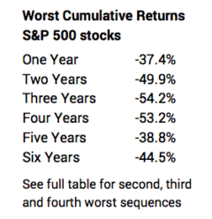
Find and display those return patterns that are the worst. Once I have annual returns listed from 1926 to the present, I can calculate the cumulative return for any number of years I pick. I then can narrow in on the worst ones.
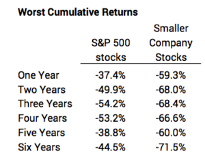
The tables below summarize the worst sequences of BAD stock returns from the table above. S&P 500 stocks are ~80% of US stock market total value; smaller company stocks are those that make up the bottom 20% of total market value.
1. BAD VARIABILITY immediately consumes big chunks of a portfolio. Eeek. Look at those percentage declines in the table below; and the decline in our portfolio would be worse when we account for withdrawals each year for our spending. These are the return patterns that drive our Safe Spending Rate (SSR%) to a low level. (Our SSR% determines the Safe Spending Amount we withdraw for our spending.) These are the return patterns that drive us to buy insurance, in effect, so we are not selling stocks for our spending in years of horrible stock returns. (See Chapters 7 and 8 in Nest Egg Care.)
2. Smaller company stocks have worse BAD VARIABILITY than S&P 500 stocks. You can see that on the table below. Some of those declines are SHOCKING. It’s true that smaller company stocks have wildly better GOOD VARIABILITY, but this picture of them does not lead me to want to overweight them in a portfolio. I recently read an article that recommends retirees greatly overweight them.** I would not agree with that.
3. We’re going to know within three to five years into our retirement period if we’re on a really bad sequence of return, meaning our Safe Spending Amount will increase each year for inflation (same constant spending power that we started with), but we’ll never Recalculate and find we can increase it by more than inflation.
We hope that we don’t start on one of these horrible returns at the start of our retirement period, but fate may mean we begin a ride on one sometime during our complete retirement period. After three years, Patti and I are at a new spending level that is 20% greater than when we started. If a bad sequence starts now, it wouldn’t have the same effect as if it had started three years ago.
4. Two two-year sequences of return are buried in many other bad sequences of return. That’s more clear when you look at the detail on the sheet.
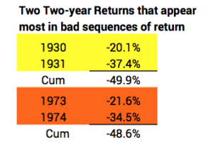
These horrible back-to-back returns – about 50% declines – have happened twice since 1871 or twice over the past 146 years. Most Retirement Withdrawal Calculators assemble their sequences of returns assuming the return for one year is independent of last year’s return. If we used that approach (applying the math of Standard Deviation to each return) we’d conclude that hitting -20% or worse and -35% or worse two years in a row is about a 1-in-1400-year event – far off the actual 1-in-about 75 that has occurred. From this fact, I gain confidence that we’re on the right track to use annual returns in the order that they’ve occurred (FIRECalc’s approach) for our planning.
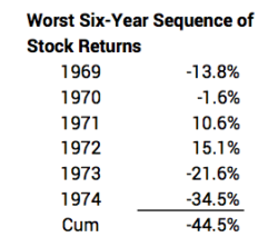
5. The longer sequences of poor returns are of most concern, since we are also withdrawing for our spending in each year. The worst six-year sequences are those that started in 1969, 1973, 1937, and 1929. The 1969 sequence as the worst surprised me; I would have thought the worst would have been during the Great Depression of the 1930s.
I display the 1969 start below. I’m pretty sure that has to be the blue line I saw on my FIRECalc graph. We’ll check that in another post. As I look at this sequence and the other three, I see they all have back-to-back years of large negative returns, and we’ve only had that once in the last 42 years now (actually three years of negative returns in 2000, 2001, and 2002, but that sequence didn’t make it in the four worst six-year sequences in history). Maybe I’m lulled, but returns like these seem so improbable that I have a sense of optimism. Our SSR% is based on the assumption that we will ride a sequences like this starting NOW, but I’m very comfortable thinking that Patti and I won’t hit something this bad. We’ll enjoy more real increases in our Safe Spending Amount.
In a future post, I’ll walk through a spreadsheet of the year-by-year calculations of portfolio value for at least the return pattern starting in 1969. (FIRECalc and all other calculators are basically using a spreadsheet to develop data for each of the year-end portfolio values displayed.) We’ll better understand how a portfolio can deplete to a level that makes it impossible to get healthy again – the tipping point – and what we can do to push that point farther into the future.
* Stocks, Bonds, Bills, and Inflation (SBBI) Yearbook. Ibbotson and Grabowski.
** See article here. The recommended stock portfolio has 36% smaller company stocks, roughly a double overweight. (Note: when you follow the steps in Nest Egg Care, you also would not get to the conclusion that you want 55% stocks and 45% bonds as your portfolio in Retirement as stated in the article. See Nest Egg Care, Chapter 8. I’ll post more on this discrepancy later.)