Stocks Real = 7.1%. Bonds Real = 2.3%
Posted on September 7, 2018
I’ve shown this graph in prior posts (download full view here), but the purpose of this post is to look at this graph in more detail and to better understand the implications for our financial retirement plan.
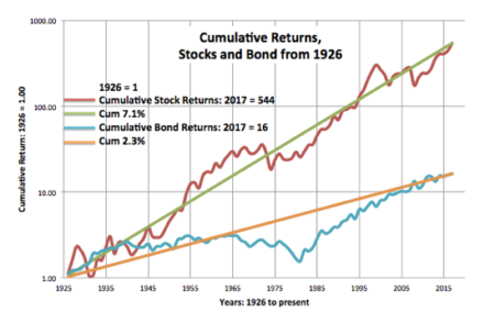
This is the plot of cumulative stock and bond returns. This is a semi-log graph. The x-axis is in years. The y-axis of cumulative returns (starting with January 1, 1926 = 1) is logarithmic; each unit of measure is the same percentage change: a change from 1 to 10 is the same unit of measure as the change from 10 to 100. Those straight trend lines (the 7.1% and the 2.3%) are of constant annual change
When I wrote Nest Egg Care, I used the average return rates displayed in Stocks for the Long Run by Jeremy Siegel, using data through 2012. Siegel displays the real return rate for stocks as 6.4% and 2.6% for bonds. My trend lines are slightly different: 7.1% is more for stocks and 2.3% is less for bonds. I may be using a slightly different data source than Siegel (See notes on pdf graph.) or drawing my trend lines differently. The differences in these rates don’t affect any decisions we make for our financial retirement plan.
What can we observe from the graph?
1. We see the obvious difference in long-term rates. The 7.1% rate for stocks is a steeper slope than the 2.3% rate for bonds. The stock rate is more than 3X that of bonds.
2. On this kind of graph, we don’t get a good picture of the effect of compound growth. I show that in the upper left on the graph: stocks compounded 544 times over the 91 years since 1926 and bonds 16 times. Stocks compounded 34 times more than bonds over this period. Wow.
3. We see that the actual lines for both stocks and bonds depart from their long-term trend line. When the actual line is going north from the trend line, the return rate is greater than the trend line. When the actual line is running west to east, the return rate is 0%; when the line is headed south, the return rate is negative.
========
For STOCKS, we see the following: three periods of rapid rise followed by periods of decline with many years to recover in cumulative return. The start of rapid declines are about 35 years apart (roughly 1930, 1965, 2000). My black lines show rapid climbs and then long plateaus.
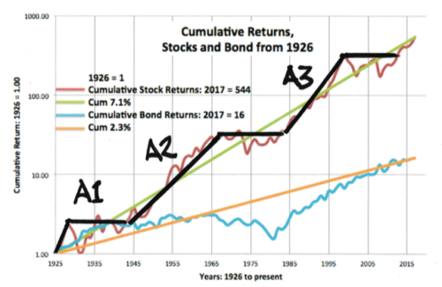
A1. The first is the rapid three-year increase from 1926 followed by a sharp decline: the start of the Great Depression. It took 15 years for cumulative stock returns to consistently surpass their 1928 level.
A2. The 23-year increase from increase from the early 1940s to the mid 1960s. The declines started in 1966. It took 17 years for cumulative returns to get back to their 1965 level.
A3. The 18-year increase starting in the 1980s through the 1990s with a decline starting in 2000. We see the deep dip in 2008. It was 14 years before cumulative returns got back to their 1999 level.
========
For BONDS we see a short, steep rise and then one big long period of zero percent cumulative returns. Then a steep recovery back to the long term trend line.
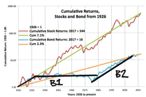
B1. From 1926, bonds followed the long term trend line for stocks, and then they wandered west to east with 0% cumulative return for 49 years from 1935 through 1984. 49 years. That is hard to believe.
B2. The sharp rise for bonds started in 1982 and rose fairly steadily through 2011. That line I drew would roughly parallel the line that I could draw for those years for stocks. That means bonds returns matched stocks over this period. (If you are picky on the start and end years, you can find periods where bonds outperformed stocks.)
Conclusion: I really like this graph of cumulative real return rates for stocks and bonds over time. Stock returns average 7.1% per year and bonds 2.3%, but we see a wide variation of both bond and stock returns over periods of time. Neither one steadily progresses along its average trend line. Our retirement period, in essence, will look somewhat similar to a segment of this plot of returns. The sequence of returns will vary for each segment we could construct. It’s essential to understand how our portfolio will fare considering the many possible sequences of returns we might face. That’s exactly what a Retirement Withdrawal Calculator does for us.